

You folks put up with a lot of crap from me, really. I never seem to have time to post and I hate that I'm so sporadic with new images. Every single person that stops by really means the world to me for taking the time to peruse.
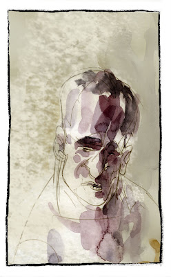
Anyhow, I thought I'd show you how things sometimes go through a development phase. These images were various tests for a period-piece, a boxing book that I might eventually actually someday get to. You can see how this stuff takes some time and consideration, especially at the early stages. I think the stuff near the top is what the project will eventually look like...it's got the right balance of atmosphere and solidity.
Hope you dig this stuff.


14 comments:
cott these are really solid! it would be really neat if you used all the different styles of these pieces in the book to express different moods or times. simliar to the array of styles you used in Soulwind. absolutely beautiful work.
BILL
The top images are composted in Photoshop, are they drawn digitally or scanned in ink drawings?
The top images are inked traditionally on paper, scanned as bitmaps, then converted to RGB and digitally painted by sampling out colors from the watercolor BG in question. The digital "paint" is applied with a variety of custom brushes.
The lower images are straight pencil and watercolor. The lettering, though, was a test, hand-lettering digitally.
I use a Cintique and Photoshop for all this stuff. The trick is to not make it TOO digital looking.
Thanks Scott. As always the work is amazing.
I loved your coloring and background work on the animation short on the Ratatooee DVD. I saw it for the Cartoon Art Museum fund raiser and it was the most exciting thing of the evening.
I work a lot with both digital and traditional media together including watercolors. Your work is always inspiring.
Brian
atomicbearpress.com
All of this is gorgeous, but man, the top images ROCK!!!
these are beautiful.
& I stick around because what you make is amazing and inspiring.
even the little bits here and there are totally enough!
Scott, you're a standup guy, and from this interview I just heard online a week or two ago (forgot who those guys were) you sound super busy. What you share with us is a privilege and a treat for us. I don't think you'll find too many of us who understand that complaining about updates (though they are nice!)
*whew*
That being said, these look wonderful Scott! I love the top images, so I'm happy to hear this is what it may look like if it ever happens! Keep up the great work! :)
I'm torn between the two sets of images. There is so much movement and action in the lower set, I can't help but wonder how the action scenes would like done in pencil and watercolor like that. There's a real sense of the European style of graphic storytelling in them.
The upper ones have wonderful strong inked lines, something I'm rather fond of myself. All I can say, really is, either version I'd buy.
-random regular viewer
Wow, this is fantastic, Scott. I really like the dark foregrounds...great sense of depth. And your work translates beautifully onto a digital canvas.
I always enjoy a peek behind the curtain... where the magic is done!
Thanks for sharing Scott!
JEEZUS!
holy moley?!
how many different styles can one man have??.......and have them all be better than anything else out there?
seriously?!
HA!
these made my day!
thanks!
i hope this works out for you.
a magic pickle cameo in this style would be insane!
JEEZUS!
holy moley?!
how many different styles can one man have??.......and have them all be better than anything else out there?
seriously?!
HA!
these made my day!
thanks!
i hope this works out for you.
a magic pickle cameo in this style would be insane!
Gosh, I don't want to mess you up or anything, but I think I actually prefer the stuff at the bottom. The last two images/pages (last four panels). I like the line work the best and I think it really jives with the color treatment well. Especially the fourth to last panel and the last two panels. The 3rd to last panel seems a touch overworked with the color and your line gets a little lost. If you're determined to go with a bolder ink line, I'd say keep the lines on the thinner side. But that's me.
All great!!
Great stuff SCott!
Holy crap, it is an understatement to call you "prolific".
Post a Comment